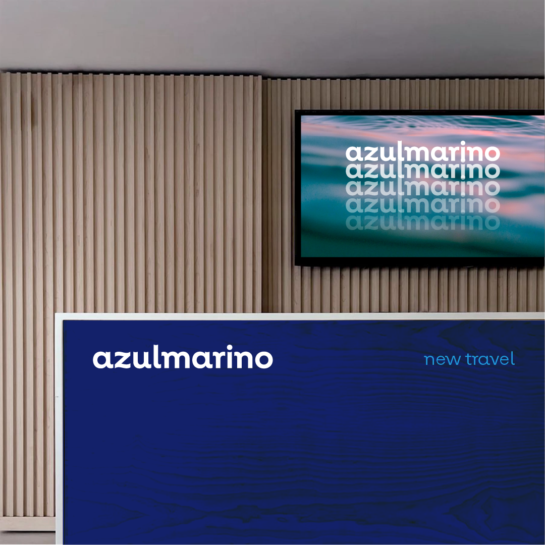
This strategic phase of our journey launched the foundation for its first visible icon: a new corporate identity for the brand. Creating a new logo and graphic code that symbolize the entire business transformation project.
The result, a visual identity starring by a typography tailor made for this project by Extra Estudio, in a graphic design project developed together with StudioRoses. Injecting a strong contemporary, dynamic, agile evocation into the brand. A clear palette of graphic elements, with a unique and at the same time discreet personality, without superficial gestures. Led by the core of the identity: a renewed blue color, more vivid and deep. The brand’s new graphic code has been conceived from an absolutely omnichannel perspective that integrates with the same naturalness in both the retail spaces and the brand’s digital platforms. A new visual interface for a network guided by a clear goal: leading a new travel paradigm for the new traveler. A project closely linked to the following stages of the strategic development of the new Azulmarino concept: the creation and implementation of the brand’s new retail environments.

